Auditing the landscape
The audit surfaced the market fit we could own, a place to differentiate on color, tone, and feel rather than features.
A fifty-year-old client services firm opens its next chapter without losing the confidence that built it.
By spring 2026, fifty years into the client services world, the firm was ready for a new welcome. The history mattered, but the site still read as an institutional explanation rather than an invitation to the people and experiences behind it.
The opportunity was not to invent a new firm. It was to make the firm already there visible: the warmth of the relationships, the breadth of the work, and the judgment behind every engagement. The redesign needed to welcome the next chapter without losing the credibility of the last five decades.
Business problem solving describes the category, rather than what makes this firm different.
Scale and financial impact lead the page, before visitors see the people behind the work.
A dense introduction and several competing links ask visitors to work out where to go next.
“See real change” gives the opening one clear message, with a short supporting line.
Services and Industries sit together, with Contact us separated as the primary action.
A human portrait and a confident color create a more personal welcome than abstract imagery.
The audit began with competitors, looking closely at the entry points and how the firms framed their expertise. For a long-standing firm, the first impression needed to make its own position clear.
I ran the same comparative pass across a broader set of consulting firms. By the end of the audit, I had a clear picture of where the category expected a convention and where the firm could break one on purpose to make the welcome feel different.
The leadership interviews, mapped against the audit, converged on one strategic direction: the welcome needed to grow more personal, more specific, and more clearly aimed at the people on the other side of the screen.
The work speaks for itself. The site should carry evidence, not claims.
Industries and offerings need to connect, so the visitor can follow either path through the work.
The firm has always personalized the engagement. The site should carry that same care.
Fifty years of relationships belongs woven into the evidence, not in a timeline.
Welcome the next decade of clients without closing the door on those who have been here for years.
Put the people, personal care, and trust in the source material.
I made the work visible in a prototype instead of a deck. Four directions, built from the same story, each at a different weight of change. Shown together, the four made it possible to talk about how far the welcome should shift and what each shift would cost.
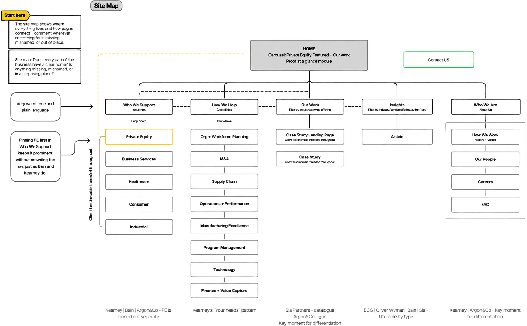
The final build drew on all four directions. The structural moves came from the architecture, the voice and texture from the lighter direction, with a clear design system supporting the whole experience.
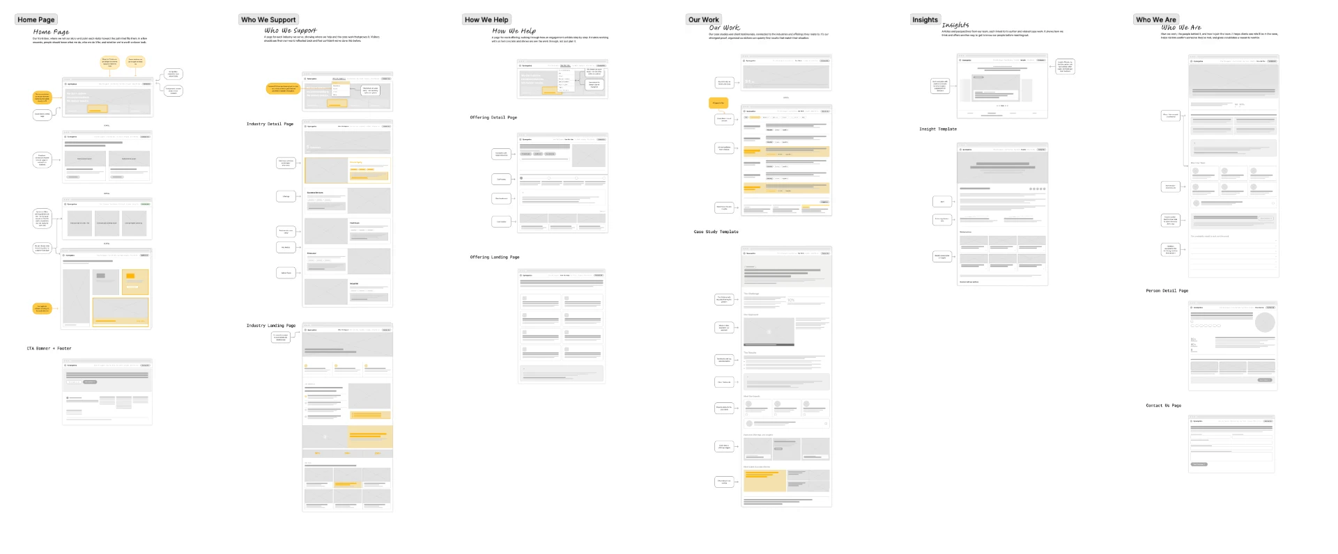
For the wireframes I annotated every section with the rationale behind it. While some of the process is invisible, each page has a clear job: guide people through the work and keep the firm’s warmth alive.
A warmer welcome.
Built on relationships.
3:1 to 5:1
Ready for what comes next.
Portfolio companies, one standard
Your P&L, understood
Where the numbers are behind
Synergetics Worldwide
Let us help you figure out where to start.
Portfolio companies
Read the case study
Typical return, validated across a decade of portfolio companies
© Synergetics Worldwide
Start with one portfolio company, one site or one function.
Tell us where the numbers are behind, and you'll talk to someone who has done the work.
One site or one function, one conversation.
Validated across a decade of portfolio companies.
The audit surfaced the market fit we could own, a place to differentiate on color, tone, and feel rather than features.
Testing navigation early became a way to differentiate, while balancing fidelity to keep everyone aligned on what we were building.
The voice had to be authentically theirs for the site to work as an introduction, so tone and word choice were designed together.
Building out the system up front let us move faster once the build started, which mattered on a tight timeline.
Launching now
The new site is launching now. Once it’s live, I’ll add the outcome metrics here.
